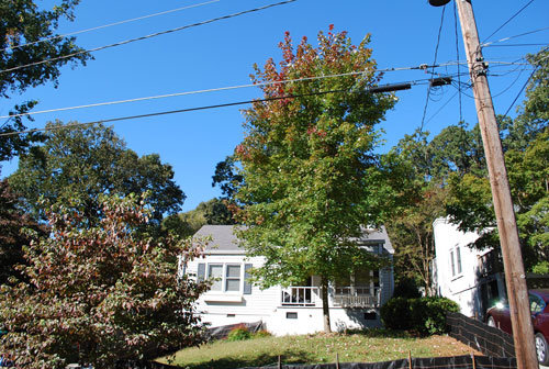
We all enjoy a good "before and after."
Maybe it's like a lady I met once said, "I love to make old houses pretty."
Here are a few ugly duckling houses that became swans. (photos courtesy of the Atlanta Journal Constitution)
All these homes had second story additions that added much needed living space--bedrooms, baths and closets. Space was added without turning them into McMansions.
This first house, in Morningside, is a good example of Painted Brick with Dark Trim. I blogged a few other homes with this paint scheme a while ago. See that post here.
AFTER
Like I said before, "There is no special place in hell for people who paint brick."
The AJC article said the owners painted this home to make the addition blend with the original. Lots of people do that. Sometimes its almost impossible to make the new brick match the old.
A few things I like about this renovation:
- added trim to gables with Tudor "turkey track" detailing
- arched roof on the portico over the front door
- shutters make the facade look finished
- they didn't paint the granite foundation
BEFORE
The next home got a HUGE facelift that includes a higher roofline, front dormer and gable- plus a front porch.
They raised the first floor ceiling height, too. I'll bet that makes it seem a lot roomier.
AFTER
BEFORE
Most of us wouldn't have looked twice at this house. It was sooo plain, tiny and downright ugly. It's located in Loring Heights; a neighborhood built in the 1940s I believe.
BEFORE
AFTER, its quite a handsome fellow. It's hard to believe it's the same house. They even added a swing on the porch. Wonder if they painted the ceiling "haint blue."
Next is my fav. Don't you just love it? I wish we had interior pictures--sigh.
This home is in Morningside, too, probably built in the 1930s.
AFTER
Why I like it:
- the color--ummm, ummm, ummm
- arched front door with gorgeous X window trim
- shed dormer with 4 windows is in proportion
- screened porch on the front retains its curved roof line
- (this is just a good picture from a good angle--we know how important that is)
BEFORE-it was big from the beginning and got bigger but not big and tacky
BACKSIDE BEFORE--the walkout terrace was great even then
My thoughts:
- I'm not crazy about the angle of this picture.
- The roof is probably flatter than I'd like, but the second story blends nicely.
- The short roof between the first and second floors is really important. It breaks up the flatness.
- That copper roof and those gutters are quite nice (cha ching!)
- The short roof over the French door is good good
- The detail and window box at the middle window add interest, again breaking up the flatness
- They didn't paint the granite foundation
If you want to read more about these renovations, scoot over to the AJC for the scoop on second story additions.
later,
Linking to:
Savvy Southern Style- Wow us Wednesday
beach cottage--Good Life Wednesday
The Shabby Creek Cottage--Transformation Thursday


